Identity · Campaign
Concept projectOcre
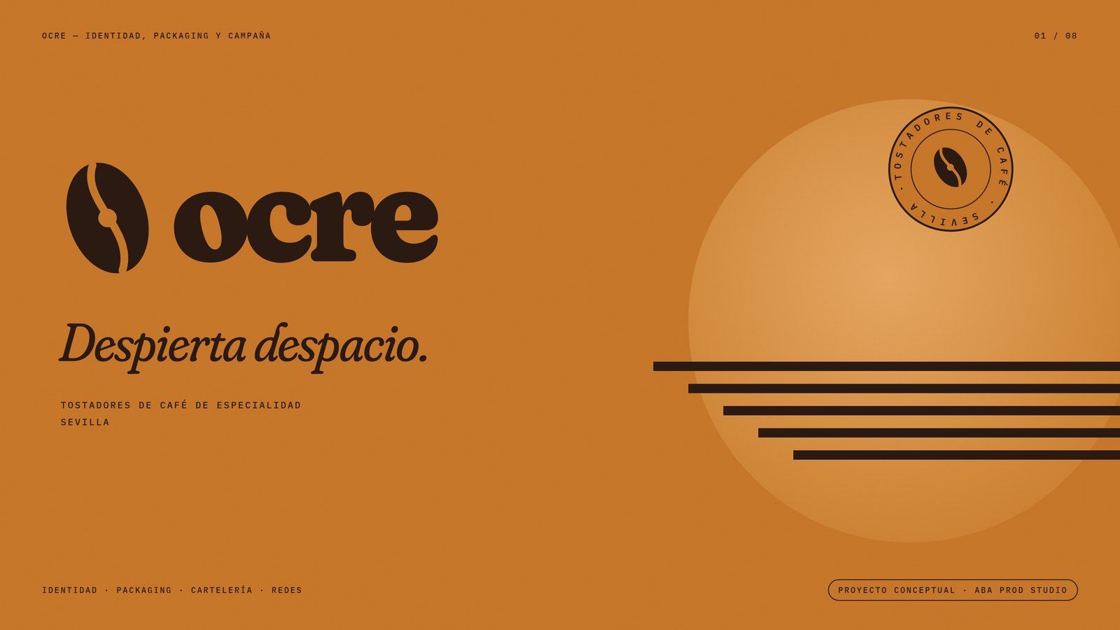
Concept identity for a specialty coffee roaster in Seville: logo, stamp, origin bags, café items, press, billboard and social media.
- Year
- 2026
- Services
- Identity and packaging
- Tools
- Fraunces · IBM Plex Mono · HTML · 4K boards
The challenge
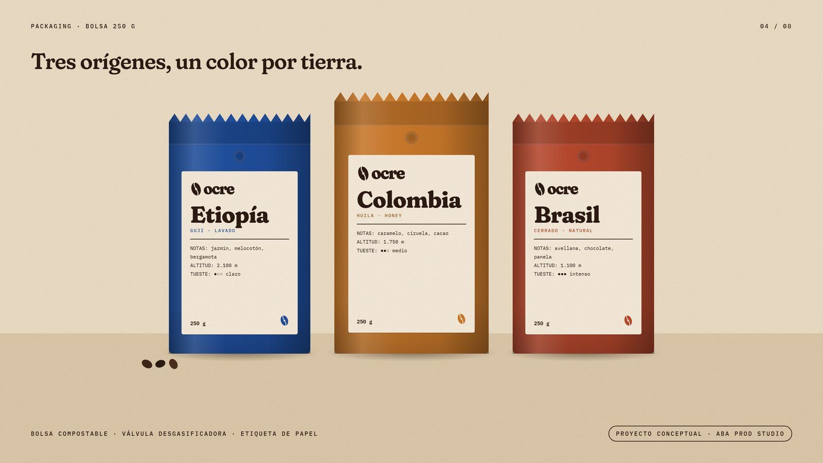
Specialty coffee is sold with labels that all look alike. Ocre needed a warm brand, recognisable from afar and able to tell each origin apart.
The idea
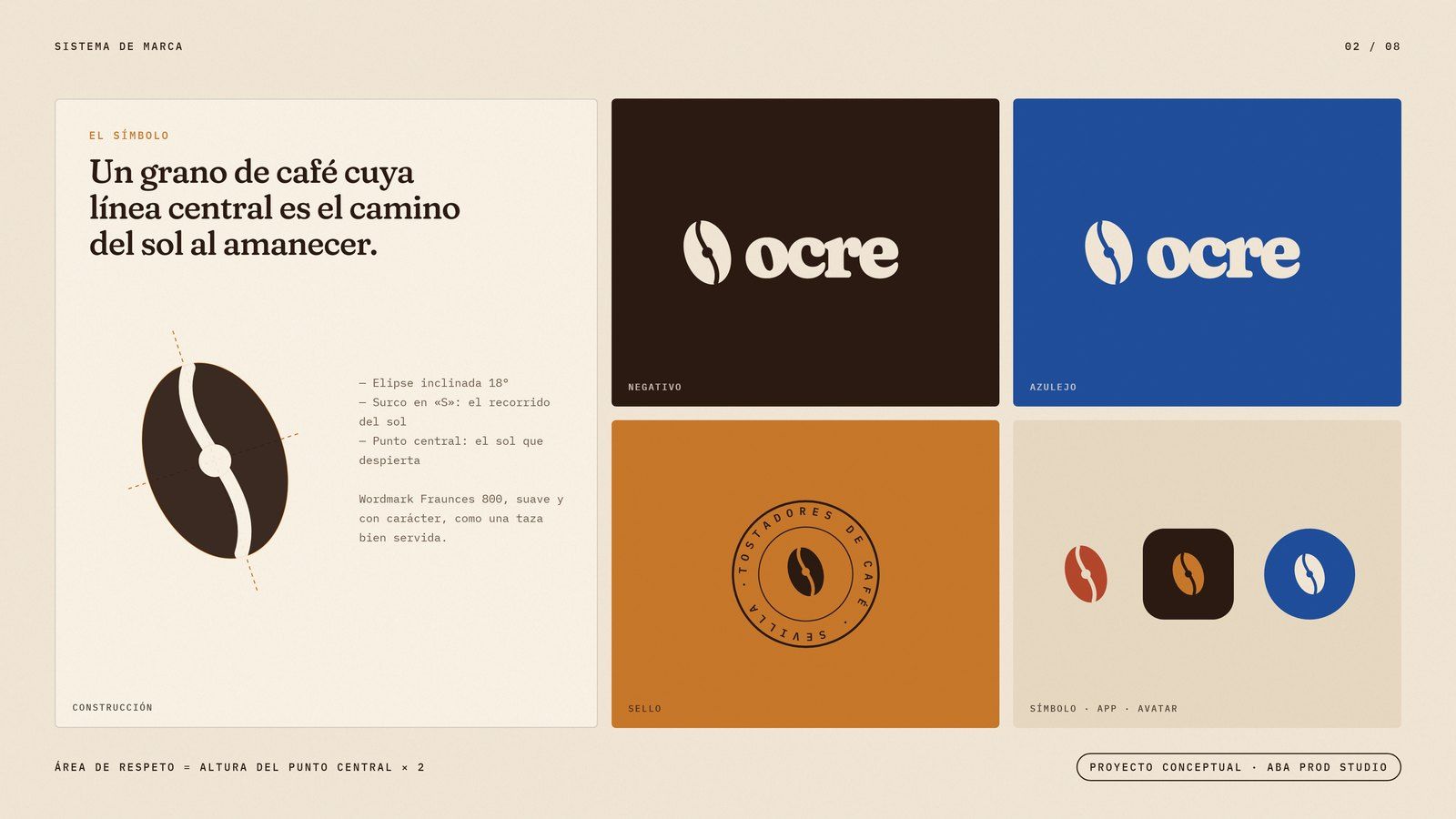
“Wake up slowly.” A coffee bean whose crease traces the sun's path at dawn. Espresso, ochre and paper, with its own colour for each country.
The process
- 01
Symbol and stamp
A bean-sun, a Fraunces wordmark and a round stamp to seal every bag.
- 02
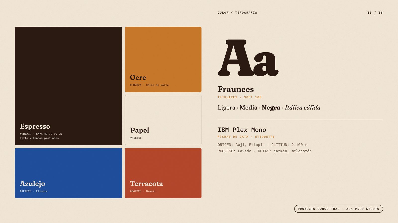
Colour system
Espresso and ochre base; cobalt for Ethiopia, terracotta for Brazil and green for Colombia.
- 03
Café
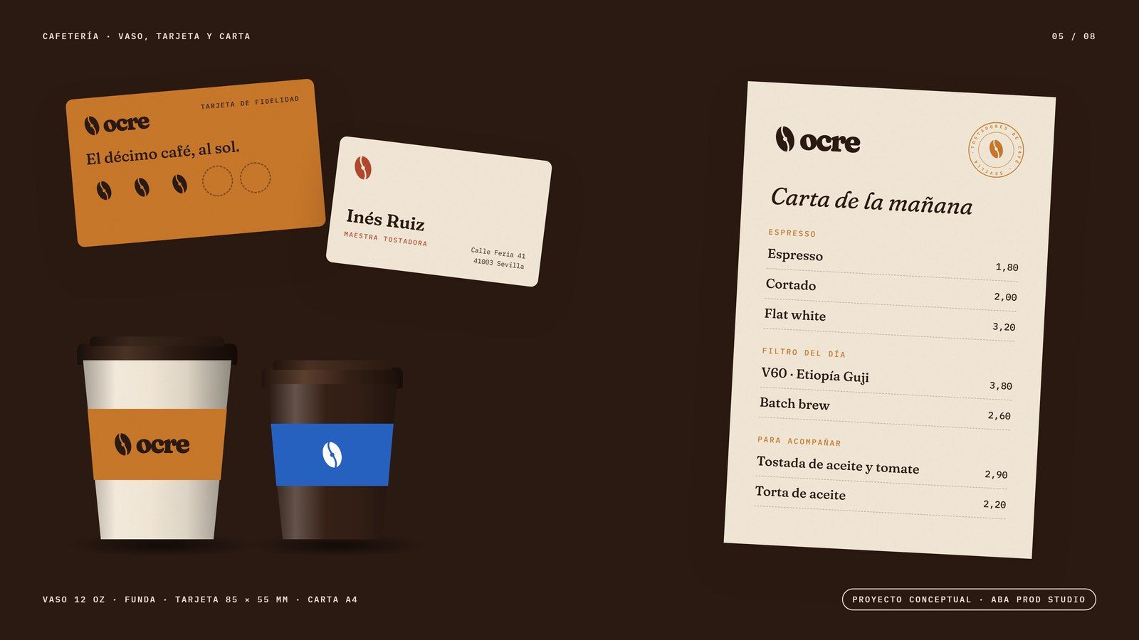
Cups seen from above like suns, a loyalty card, business card and menu.
- 04
Campaign
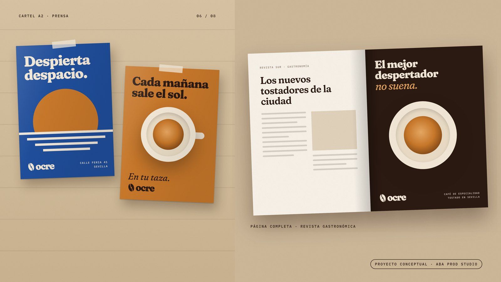
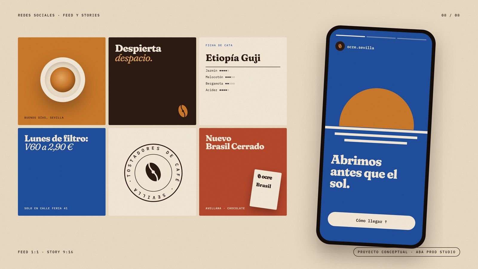
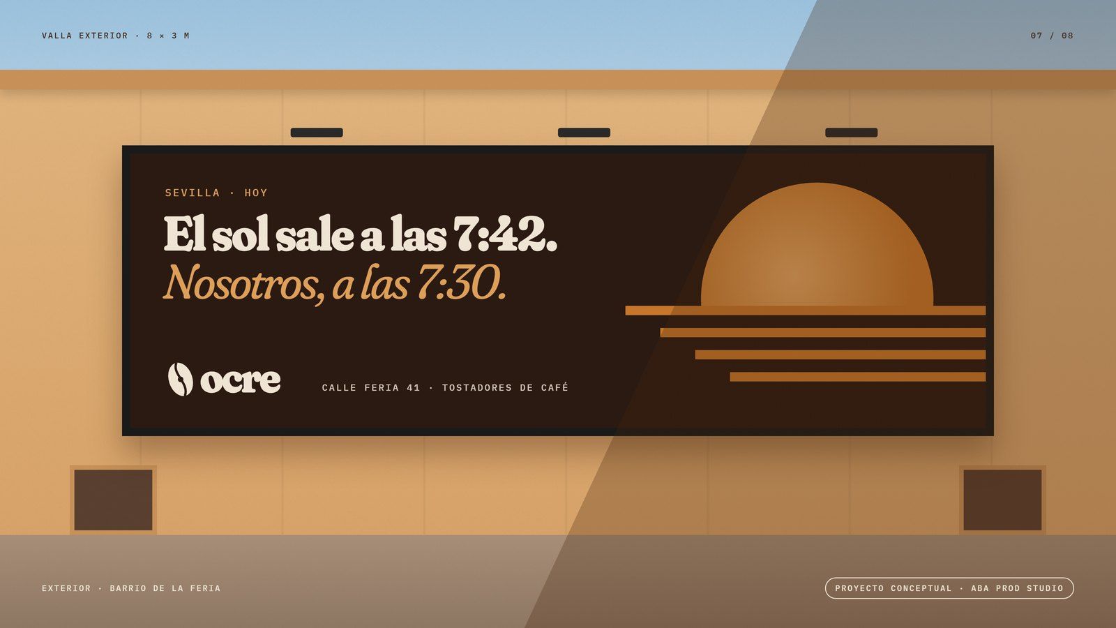
A2 posters, a magazine ad, a billboard in the Seville sun and social posts.
The result
A brand you recognise on the shelf, in the street and on your phone, with a story that tells itself.